
📌 Mini Case Study
Mizanstore provides a quality collection of books 📙 with easily accessible online sales services 💰 and often holds attractive promotions. As a result, Mizanstore has become a favorite destination for readers seeking the latest and best books. 📈
After trying the login and register page of the mizanstore page, there are 2 types of problems that we found:
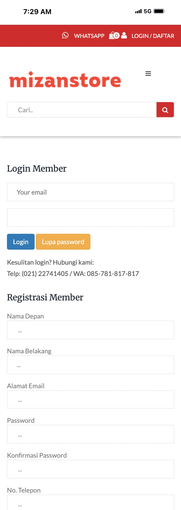
Display is not attractive and clean, many components should not need to be added so that it makes users confused.
Login and register display are one, this confuses users because there are many forms that must be filled in.
From the many ideas we received, we decided to select the most relevant features:

Design a simplified and user-friendly Register and Login page by:
Using minimal input fields – Ask only for essential information (e.g., name, email, password) to register, and email + password to log in.
Ensuring a clean and intuitive layout – Clear labels, high-contrast buttons, and no distractions.
Mobile-first approach – Optimize for smaller screens, with touch-friendly buttons and large input fields.
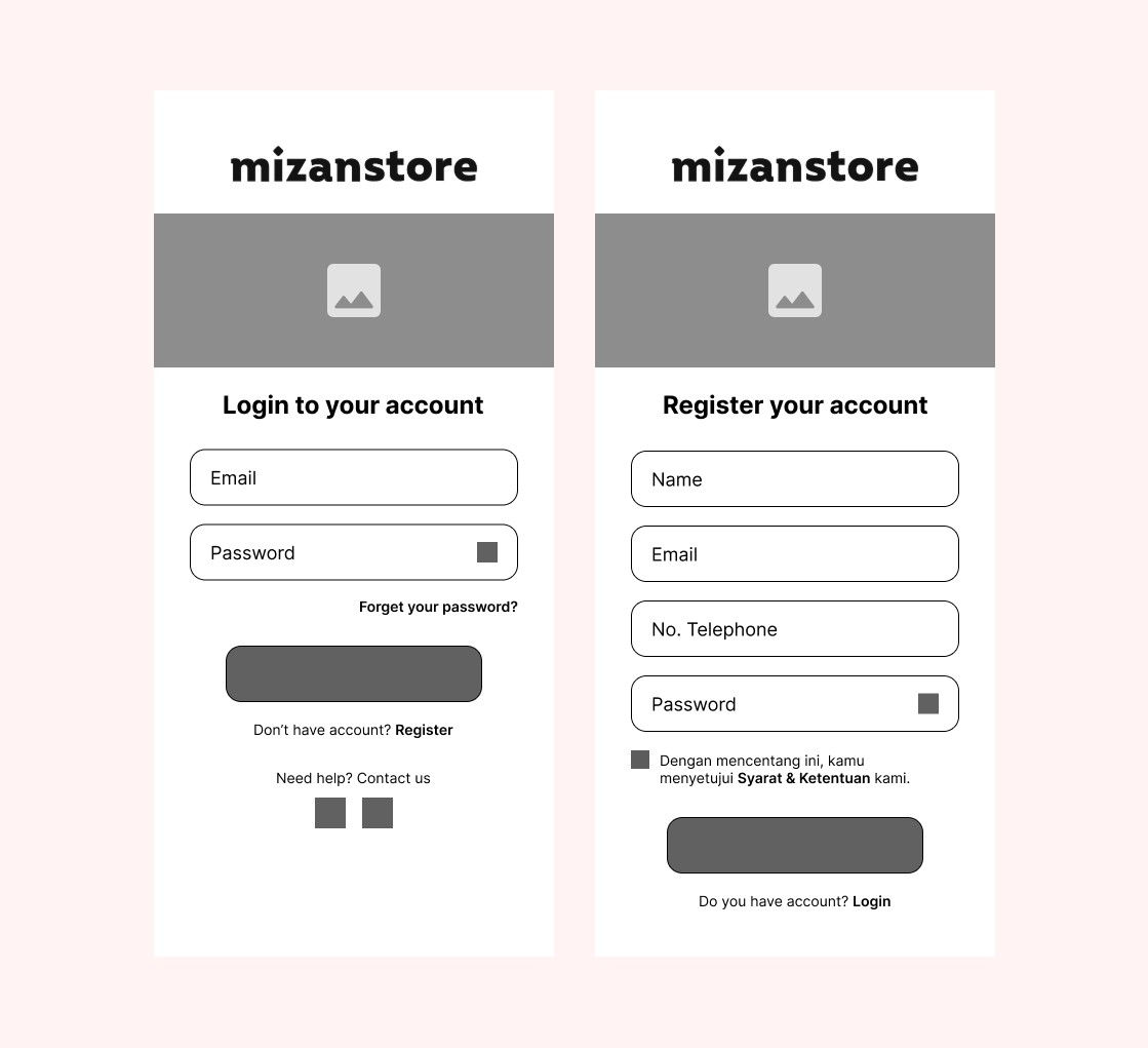
After understanding our user's needs, we started creating wireframes and high-fidelity designs.
This is our first concept for the Login and Register Page:
This is our first concept for the transfer flow:

This is final design of Login and Register Pages Mizanstore:

During this project, i learn a lot about to designing color, typography, and validate my design to avoid bias.
If you are interested with my work, feel free to contact me. I am excited for collaboration and new opportunities. Thank you!
📨 portfolioulum@gmail.com → • 📝 CV/Resume → • 👨💻 LinkedIn →
© 2025 - Ahmad Miftahul Ulum